
Rose Quartz & Serenity are the Pantone Colors of the year 2016. With a palette of colors that give you an overwhelming sensation of tranquility, we introduce for the first time two colors as the Pantone selection for 2016: Rose Quartz & Serenity.

For the first time, the blending of two shades – Rose Quartz and Serenity were chosen as a softer approach to this upcoming year. As consumers seek mindfulness and well-being as an antidote to modern day stresses, welcoming colors that psychologically fulfill our yearning for reassurance and security are becoming more prominent. Joined together, Rose Quartz and Serenity demonstrate an inherent balance between a warmer embracing rose tone and the cooler tranquil blue, reflecting connection and wellness as well as a soothing sense of order and peace.
SEE ALSO: TOP Most Coveted Design Brands in the world
In many parts of the world, we are experiencing a gender blur as it relates to fashion, which has in turn impacted color trends throughout all other areas of design. This more unilateral approach to color is coinciding with societal movements toward gender equality and fluidity, the consumer’s increased comfort with using color as a form of expression, a generation that has less concern about being typecast or judged and an open exchange of digital information that has opened our eyes to different approaches to color usage.

WHAT IS THE PANTONE COLOR OF THE YEAR?
A symbolic color selection; a color snapshot of what we see taking place in our culture that serves as an expression of a mood and an attitude.
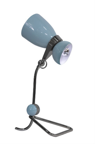
For the first time, Pantone introduces two shades, Rose Quartz and Serenity as the PANTONE Color of the Year 2016. Rose Quartz is a persuasive yet gentle tone that conveys compassion and a sense of composure. Serenity is weightless and airy, like the expanse of the blue sky above us, bringing feelings of respite and relaxation even in turbulent times.

And to get in the mood, DelightFULL revealed a couple of pieces that will definitely be the next trend in home design. Take a look at the 2016 trends with Pantone Color of The Year suggested by the design brand DelightFULL:
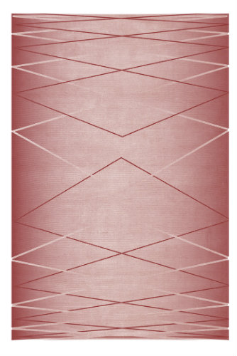
Hitchcock Mid-century Modern Rug
You can visit DelightFULL’s Inspirations Page as well as our pinterest boards in order to get more inspirations. Get more ideas for your projects and find functional, stylish and sizable lighting and furniture choices.


