Judging by the title, you know you are about to find out why Otter by Pantone is the right shade of brown for you to use in your wardrobe and home decor this Fall… Continuing to talk about the best colors in the Pantone Fall Fashion Report, we are kicking off this week talking about a very special shade of brown. Featured in the London Color Palette, Otter is a pasty tone with earthy notes, very Fall appropriate. Let’s find out why this is the right color for you!
RELATED: Pantone Fall Fashion Report: The Benefits of Using Shaded Spruce
INTRODUCING OTTER…
PANTONE 18-1018 TPG
Otter
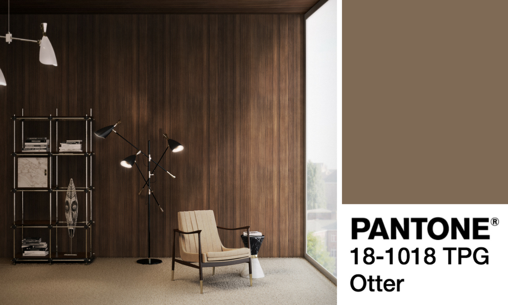
According to Pantone, ‘Otter’ is “a country color that comes to the city,” adding “an earthy grounding and a sense of rootedness.” It will most likely be one of the strongest colors of the upcoming Fall. Starring in Givenchy’s runway, Otter can also be transported to your home decor in the easiest way. Keep reading and check out why this is the perfect shade of brown for you this Fall/Winter.
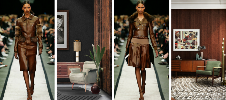
IN THE FASHION INDUSTRY
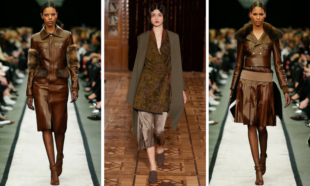
Brown came in full force to the London Fashion Week, with Otter being one of the stars in multiple runway shows throughout the week. Especially in the Givenchy F/W 2018 collection, this Pantone fall color was everywhere, showing us how sophisticated and high-end it can be. So, don’t be surprised if in the next couple of months all you see in every Zara you walk in are different clothing items boasting this gorgeous shade of brown!
IN THE INTERIOR DESIGN WORLD
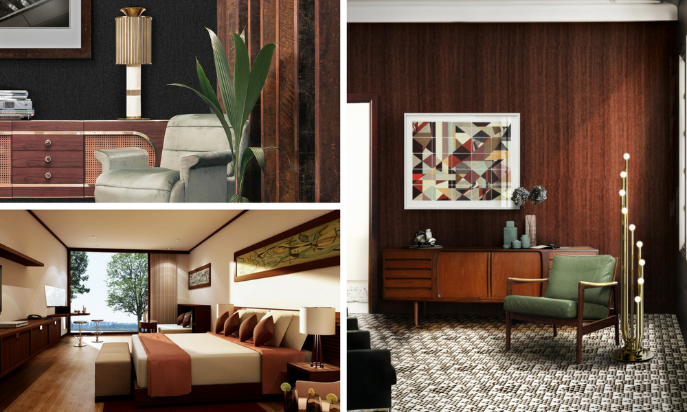
Choosing to have a brown home decor might not be your first instinct, we understand that. However, what you must keep in mind is how this sophisticated shade of brown can change your whole home decor in the next months. You can start with a few mid-century classic sideboards here and there, a few lamps or just some decorative pillows in your bedroom or living room sofa. Otter is also a great color to pair up with pastel colors such as avocado green, tangerine or even that stunning yellow you love so much.
MID-CENTURY OTTER FURNITURE PIECES
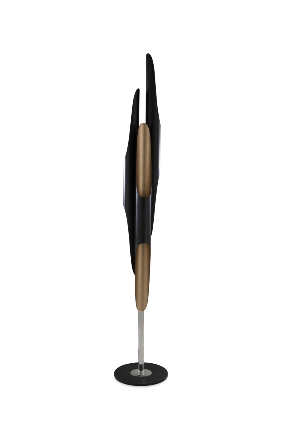
Inspired by the American jazz saxophonist and composer John Coltrane, Coltrane floor lamp embodies the avant-garde jazzy vibe that this legendary musician transmitted in every music concert.
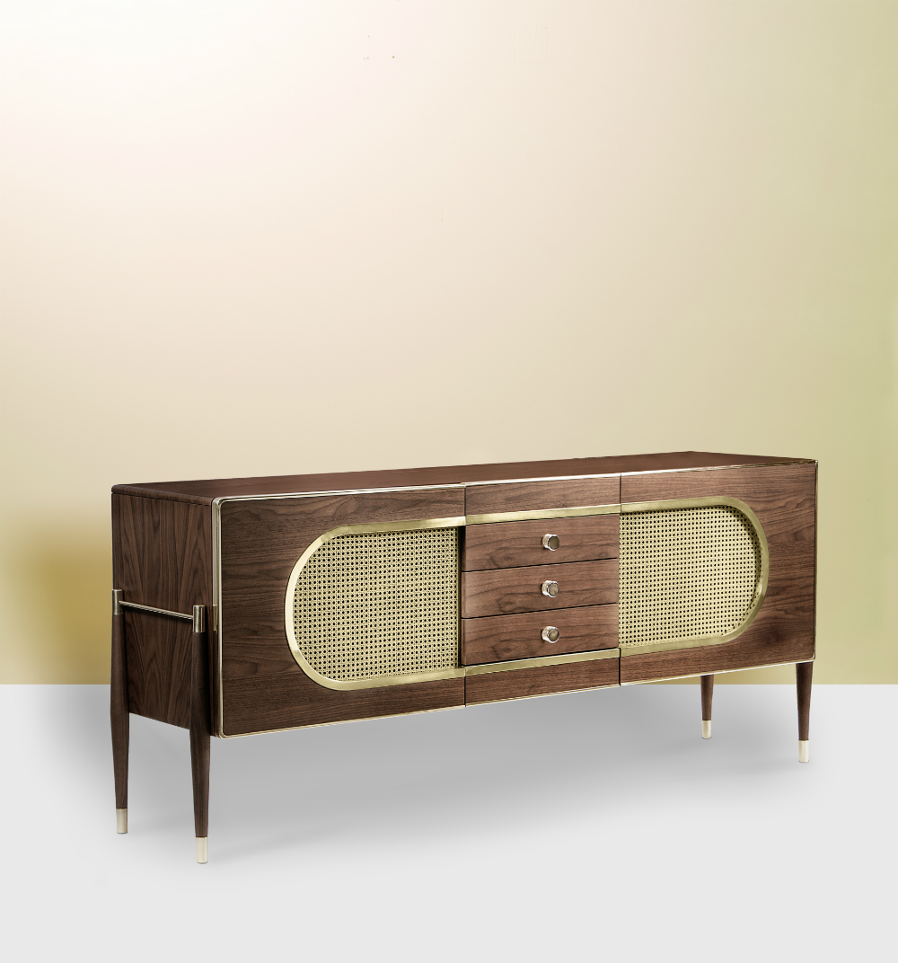
Dandy is a sleek and stylish sideboard. Because of its versatility, it can be used as a drinks cabinet and be placed both in a living room or dressing room. Its body is entirely made of solid walnut wood and it resembles a kitsch radio, because of its shape and the use of grill cloth on the doors.
LET’S RECAP!
Below you can find a small infographic that summarizes all the info we have just given you. Make sure to pin it to your Pinterest boards and have fun! 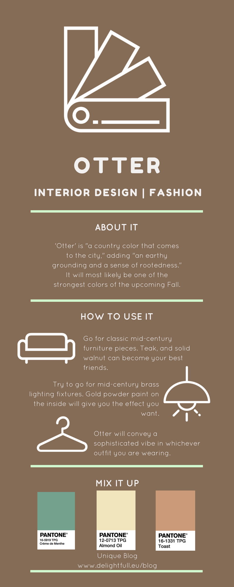
© Icons made by Freepik from www.flaticon.com
MORE INSPIRATION: 13 REASONS WHY EVERYONE LOVES MID-CENTURY MODERN DESIGN
You can visit our Pinterest boards in order to get more inspirations. Get more ideas for your projects and find functional, stylish and sizable lighting and furniture choices. Make sure to download our ‘Interior Design Tips for a Well-Lit Home‘ eBook!


